
Vinyl Revival

Sales of vinyl records have rocketed up for a 16th consecutive year, so why are vinyl records having such a resurgence?
The allure of vinyl records is a combination of sound quality, physicality, nostalgia, and collector culture. Even though streaming services have made listening to digital music more convenient and accessible than ever, vinyl remains a beloved format for many music fans, bringing back fond memories and through owning a piece of music history.
The first record I bought was Joy Division when I was twelve, which is now a highly collectable and valuable original pressing that I am proud to own. I used to write my school homework whilst listening to John Peel on the radio, who was a huge influence on my dark and grungy music taste. When I play a record, I love the dusty pops and grainy crackles as the needle falls into the grooves and, for me, it all adds to the raw quality of the sound.
It's not just about the music though. A big part of the joy of owning a record is the varieties in cover design, adding visual interest to a work of art. You might see photographic portraits, paintings, sketches, collages or they might be minimalist with nearly nothing at all. The artist might feature plastered all over the front cover, or perhaps they take a backseat entirely, letting evocative imagery pull the listener into their world.
Here are my top ten classic album cover designs:
-
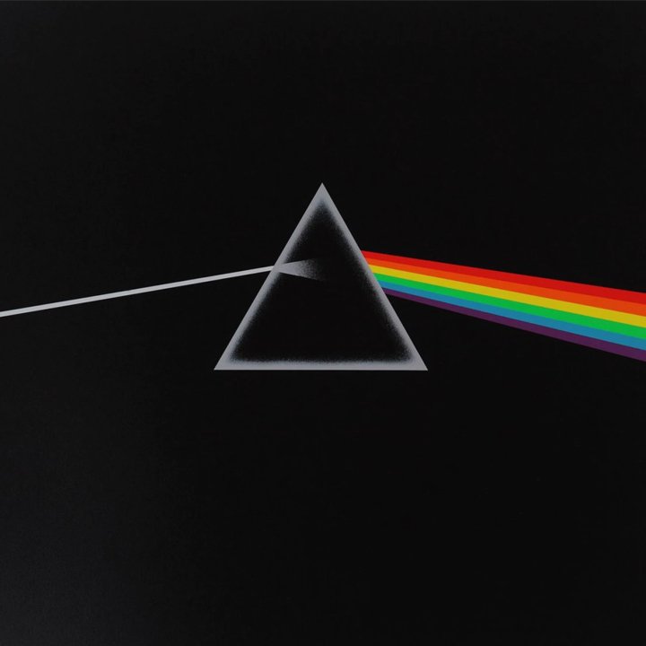
(design by Hipgnosis/Storm Thorgerson/Aubrey Powell)
British graphic designer and artist Storm Thorgerson has created some of the most iconic album cover artwork ever made, including the globally recognised Pink Floyd 1973 progressive rock album ‘Dark Side of the Moon'. It's a simple yet striking cover art: a triangular prism set against a black background with a ray of light refracting through it. Though the band's name and the record's title do not appear on the front cover, the design is universally recognisable and synonymous with Pink Floyd. Some of Thorgerson's legendary album artwork was recently shown at the CCA Galleries in Jersey in an exhibition in 2022 called 'The Front Cover'.
-
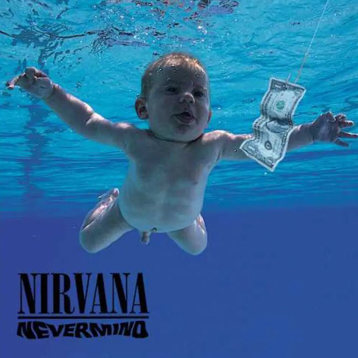
(design by Robert Fisher)
The image of a baby grasping at a dollar bill became one of grunge’s coolest and most enduring symbols, an album cover that captured the attitude of Nevermind and the era. The baby in question, Spencer Elden, has even recreated the photo for numerous photo opportunities. Controversially, and perhaps somewhat hypocritically, Elden filed a lawsuit (and lost) claiming that the image constituted child sexual abuse. He claimed that the album cover had caused him 'permanent harm' and a 'lifelong loss of income-earning capacity'.
-
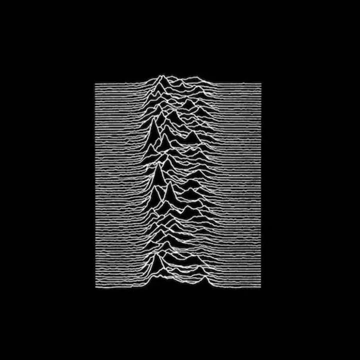
(design by Peter Saville)
The cover of Joy Division’s 1979 debut record is an actual depiction of radio waves. This stark black-and-white artwork has become so iconic that it’s also a popular T-shirts design. One of the reasons I love this design is because I can recreate it using Adobe After Effects Trapcode Form plugin!
-
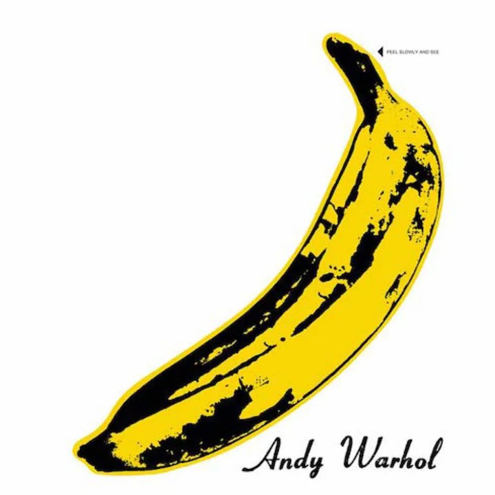
(design by Andy Warhol)
The famous minimalism of the peel-away banana album cover became an influence on punk visual style many years later and remains one of the greatest album covers. Warhol designed the album cover so that early copies had an interactive element. The banana’s vinyl skin could be pulled away, revealing a pink fruit underneath. “Peel slowly and see” the rather suggestive text reads!
-
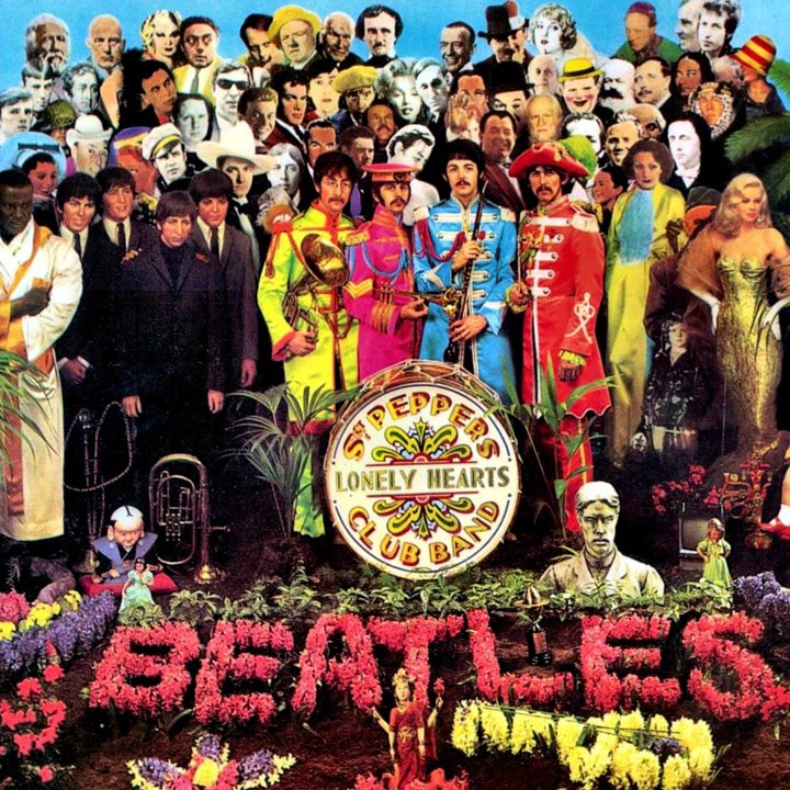
(design by Peter Blake)
The cover of the Beatles' 1967 LP Sgt. Pepper's Lonely Hearts Club Band is, without a doubt, one of the most iconic images in the history of rock & roll. Peter Blake’s pop-art assemblage where the band are standing amidst cardboard cutouts of their heroes.
-
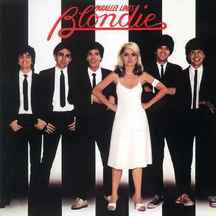
(design by Ramey Communications)
The great thing about the famous Blondie Parallel Lines album cover isn’t just the black-and-white composition but the way Debbie Harry exudes girl power confidence, while all the guys look like complete geeks. This album cover has recently been hilariously recreated by Blur, with Damon Albarn playing the role of Debbie Harry.
-
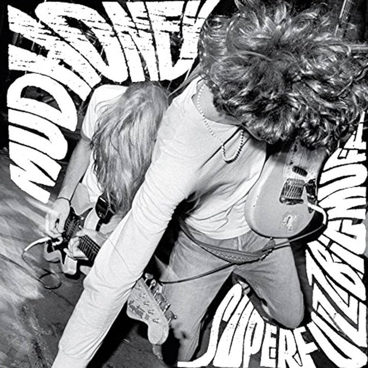
(design by Lisa Orth, type by Ed Fotheringham, photo by Charles Peterson)
Maybe not a traditional classic, but a personal favourite and my original copy is one of the most valuable items in my collection. I loved the Sub Pop record label, pioneers of the Seattle grunge scene in the late 80s/early 90s. Everything about this cover screams 'play me loud' and promises a riot of noise is about to be unleashed. The cover art is a photo of guitarists Mark Arm and Steve Turner on stage, and it perfectly embodies the wild, drunken antics the band was famous for in concert in those days.
-
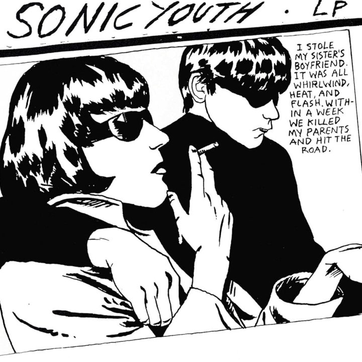
(design by Raymond Pettibon)
Probably my all time favourite album and sadly my original copy is now horribly warped. I love this hand-drawn cover which is based on a newspaper photograph of Maureen Hindley and David Smith, key witnesses in the 1966 Moors Murders trial involving serial killers Myra Hindley and Ian Brady, with the stark black and white drawing accompanied by darkly mysterious comic-book style dialogue.
-
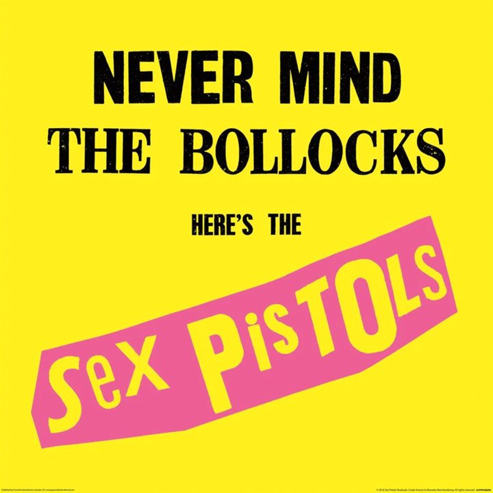
(design by Jamie Reid)
This album cover is super simple featuring only the title of the album and the name of the band. The fluorescent colours it was printed in and the title were chosen in order to be noticed and to offend. The typography is thick and bold. It clearly references the big ideologies of the punk movement - anarchy and challenging the status quo.
-
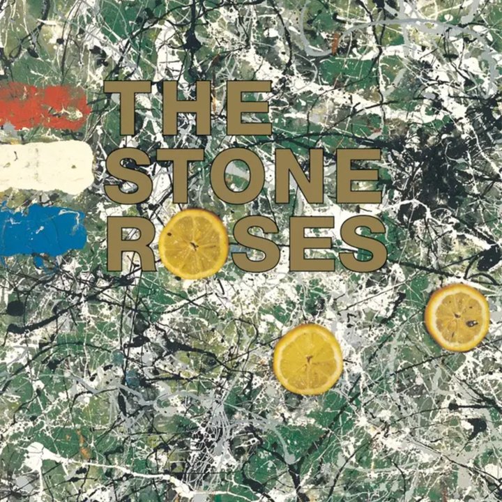
(design by John Squire)
Roses guitarist John Squire was a talented artist and his paintings adorned the band's singles. For their debut album, a piece of art called 'Bye Bye Badman' was pressed into service, with its Jackson Pollock-esque paint splatters forming a backdrop to the album's title. The slices of lemon - along with the title - are a reference to the student riots in Paris in 1968.